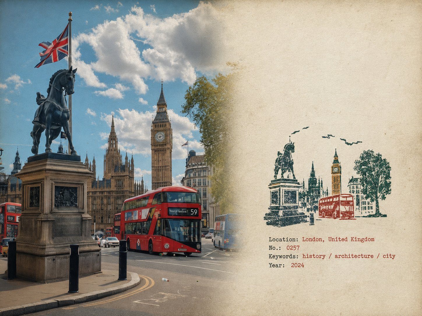
橡皮章旅行田野笔记海报
完整提示词
Rubber Stamp Travel Field Notes Poster — Natural Realism Version

Create a separate “Rubber Stamp Travel Field Notes Poster” for each photo I upload. Output each photo individually. Never create a collage or combine multiple photos.

Use a 4:3 landscape composition with a natural visual transition between the original photograph on the left and the aged-paper field-note area on the right. Do not add an obvious dividing line.

LEFT — ORIGINAL PHOTOGRAPH

The left side should occupy roughly 58% of the frame.

Keep the uploaded photograph visually authentic and recognizable. Preserve the original subject, perspective, terrain, architecture, plants, people, spatial relationships, natural light, shadows, textures, and overall atmosphere.

Do not redesign or reinterpret the photograph.

Only apply a very subtle editorial photo treatment: gentle tonal balancing, restrained color grading, slightly softened highlights, and extremely fine natural film grain. It should still look like a real photograph taken on location rather than an AI-generated image.

Natural cropping is allowed if needed to fit the 4:3 layout, but do not stretch, distort, move, replace, or redraw the main subject.

Avoid excessive sharpness, HDR effects, artificial clarity, cinematic color grading, or overly perfect details.

RIGHT — AGED PAPER FIELD NOTES

The right side should occupy roughly 42% of the frame.

Use warm off-white, slightly aged paper with a believable physical texture. Include very subtle paper fibers, fine grain, faint handling marks, and a matte surface.

Keep large areas completely unprinted.

The paper should feel like a real sheet from an architect's travel notebook or field journal, not a designed poster background.

Avoid overly strong stains, decorative textures, vintage filters, or artificial grunge.

SMALL RUBBER STAMP

Study the uploaded photograph and identify only the few visual features that make the location immediately recognizable.

Reduce them into a compact, imperfect multi-color rubber stamp impression.

Do not reproduce the photograph element by element.

Simplify aggressively and retain only the most meaningful visual relationships:

- distinctive architecture and silhouette
- important roof, tower, dome, arch, or structural shape
- mountain or terrain contours
- shoreline or road direction
- a few recognizable trees or vegetation forms
- simplified settlement layers
- one or two important foreground shapes when visually relevant

Remove crowds, cars, dense windows, repetitive buildings, tiny vegetation, decorative objects, and insignificant background details.

The result should look like something a traveler could have actually carved into a small rubber stamp, not a miniature illustration of the entire photograph.

Place the stamp in the lower-middle portion of the right paper area, occupying approximately 30–38% of the right section's height.

Keep generous blank paper around it.

Do not enlarge it into a large illustration.

STAMP COLOR & PRINT CHARACTER

Extract approximately 2–4 muted spot colors naturally from the original photograph.

Possible colors include:

- carbon black
- deep green
- brick or muted red
- ochre
- slate blue
- taupe or earthy brown

Do not force these colors if the photograph suggests a different restrained palette.

Each color should appear as a separate physical ink layer.

Make the print feel genuinely handmade:

- slightly uneven pressure
- tiny gaps in the ink
- dry areas
- paper showing through
- rough carved edges
- irregular line thickness
- small contour breaks
- granular ink texture
- faint ghosting
- slight natural color-layer misregistration
- subtle edge variation

The imperfections should be small and believable, as if the stamp was pressed onto paper by hand.

Avoid perfectly aligned digital layers, smooth vector edges, clean gradients, or artificially exaggerated distress.

The stamp should look physically printed, not digitally illustrated.

FIELD-NOTE TYPOGRAPHY

Generate a small amount of text based only on the actual location and imagery in the photograph:

Location — English name
No. — Number
Three short English keywords
Gregorian calendar year

Place the text below or beside the stamp within the available whitespace.

Use a small, understated typewriter or archival field-note style.

The typography should have very slight mechanical irregularity, as though typed or printed on an old field notebook.

Keep it quiet and secondary to the photograph.

Spell the location and all words correctly.

Do not add slogans, brands, tourist phrases, decorative quotes, or unnecessary text.

OVERALL REALISM

The finished image should feel like a real travel photograph mounted beside a small handmade field stamp on an architect's personal notebook page.

Prioritize subtle physical realism over visual perfection.

The photograph should remain the strongest visual element.

The stamp should feel like a small fragment of memory extracted from the photograph rather than a second illustration.

Use restrained contrast, natural imperfections, believable paper texture, and slightly imperfect printing.

The final result should feel quiet, tactile, documentary, collectible, and genuinely handmade.

Avoid

Obvious dividing lines, circular seals, postage-stamp borders, perforations, wax seals, sticker layouts, souvenir-card designs, generic travel templates, smooth vector logos, polished digital illustrations, cartoon styling, 3D rendering, plastic textures, glossy gradients, excessive saturation, HDR effects, excessive text, decorative clutter, overly clean geometry, perfectly aligned ink layers, dense miniature architecture, or any alteration/redrawing of the original photograph. 
看懂这条提示词
点点逐段翻译每张旅行照片做成一张「橡皮章旅行田野笔记」:左边是原照片,右边是旧纸上的一枚手工橡皮章和几行打字机小字。
逐段在说什么
- 1
Create a separate… for each photo每张照片单独出一张,不要拼贴;横版 4:3,左右自然过渡,不要分割线。
- 2
LEFT — ORIGINAL PHOTOGRAPH左侧约占 58%:保留原照片的真实样子,只做很轻的调色和胶片颗粒,不重画、不变形。
- 3
RIGHT — AGED PAPER FIELD NOTES右侧约占 42%:像建筑师旅行笔记本的一页旧纸,有细微纤维和使用痕迹,大面积留白。
- 4
SMALL RUBBER STAMP / STAMP COLOR橡皮章:只提取地点最有辨识度的几个轮廓,简化成一枚小印章,用 2 到 4 种从照片里取的低饱和颜色,带手工按压的不均匀感。
- 5
FIELD-NOTE TYPOGRAPHY / Avoid文字:地名英文、编号、三个英文关键词和年份,用打字机字体,安静地放在印章旁边;不要圆形印章、邮票齿孔、卡通和 3D 效果。
小贴士这条很长但不用改,直接上传照片就能用。地名拼写偶尔会错,生成后核对一下。
来源
- 原作者
- @MahnoorAi12
- 收录自
- Awesome GPT Image 2MIT 协议
提示词与效果图版权归原作者所有,本站仅作学习参考;标题、分类与变量说明由灵点AI 翻译整理。如需调整署名或删除,请邮件 seadxiao@gmail.com。