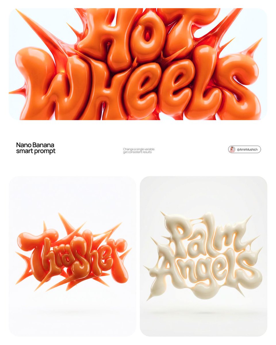
Y2K 充气涂鸦立体字
完整提示词
[BRAND NAME] | [COLOR]

Act as a 3D Type Designer and CGI Artist working at the intersection of streetwear culture, Y2K aesthetics, and high-end digital sculpture. Your references: Nigo, Futura, Guccimaze, Soulwax art direction.

---

PHASE 1: TYPOGRAPHIC CONCEPT

Render the word or logotype [BRAND NAME] as a fully 3D sculptural object — not a flat text with extrusion, but a living, inflated, organic type sculpture. Style: Wildstyle graffiti DNA fused with inflatable balloon morphology. Letters are not separate — they flow into each other as one continuous organic mass. Each letterform has: bulbous pneumatic body as if inflated under high pressure from within, stretching the surface taut. Aggressive spike extensions — sharp tapered protrusions erupting between and around letters, directional, asymmetric, energetic, some long and blade-like, others short and thorn-like. Wildstyle overlaps — letters partially occlude each other creating depth layers, classic graffiti ambiguity where readability fights with visual complexity. Organic connective tissue — negative spaces between letters filled with stretched membrane forms, like rubber pulled between two inflated surfaces.

---

PHASE 2: MATERIAL & SURFACE

Single unified material across the entire sculpture — no color variation between letters. Material type: high-gloss latex / inflated rubber / soft silicone — the surface behaves like a balloon skin stretched to near-bursting point. Subsurface scattering: active — light penetrates slightly into the material, creating a translucent inner glow at thin edges and spike tips. Thinner areas read lighter, denser volumes read darker. Specular highlights: large, soft, slightly elongated — the kind you get on inflated latex, not hard plastic. Multiple secondary highlights in concave zones. Apply [COLOR] as the sole material color of the entire sculpture — this is non-negotiable. [COLOR] defines the pure midtone of the material. Highlights push toward the most luminous near-white version of [COLOR]. Shadow zones and deep crevices push toward the darkest most saturated version of [COLOR]. The entire chromatic range of the sculpture lives within the [COLOR] family — no hue deviation, no neutral grays.

---

PHASE 3: COMPOSITION & STAGING

Background: pure white (#FFFFFF) — clinical studio isolation. Zero texture, zero gradient. Shadow: none, or absolute minimum contact shadow directly beneath the sculpture — the object appears to float slightly. Orientation: horizontal spread — the sculpture is wider than tall, expanding laterally. Spike elements breach the invisible bounding box on all sides — top spikes reach upward, side extensions push outward. Camera angle: straight-on frontal, slightly elevated 5 to 10° above center — reveals the full typographic mass while showing the 3D depth of overlapping elements. Depth of field: none — sharp from foreground spikes to background letter bodies, every detail in focus. Scale feel: monumental — as if the sculpture is 2 meters wide in physical space, photographed in a white infinity studio.

---

PHASE 4: TECH SPECS

Render engine: Octane Render or Redshift — physically accurate subsurface scattering mandatory. Global illumination: large soft HDRI dome light, neutral white temperature 5500K. No directional shadows. No rim lights. No background elements. Ray tracing: on — for accurate specular and inter-reflection between letter surfaces. Anti-aliasing: maximum — edges must be razor-clean against white background. Output feel: this is a CGI product render, not AI art. Precision over expressionism. Aspect ratio: 1:1 square — centered composition with breathing room on all four sides.
使用前替换这 2 个变量:
- BRAND NAME
- COLOR

看懂这条提示词
点点逐段翻译生成一个 Y2K 风的充气涂鸦立体字:品牌名做成像气球一样鼓起、带尖刺的 3D 雕塑,整体只用一种颜色。
逐段在说什么
- 1
[BRAND NAME] | [COLOR] / Act as a 3D Type Designer…身份设定:你是一位游走在街头潮流、Y2K 美学和数字雕塑之间的 3D 字体设计师。
- 2
PHASE 1: TYPOGRAPHIC CONCEPT字形:把品牌名做成完整的 3D 雕塑,像涂鸦里的狂野字体融合充气气球;字母连成一体,鼓胀饱满,字母之间伸出尖锐的刺,互相遮挡,缝隙里有拉伸的薄膜。
- 3
PHASE 2: MATERIAL & SURFACE材质:整体是高光乳胶或充气橡胶,像快撑破的气球皮,边缘透光;只用指定的一种颜色,亮部偏白、暗部偏深,不能出现其他色相。
- 4
PHASE 3: COMPOSITION & STAGING构图:纯白背景,几乎没有阴影,像悬浮着;横向展开,尖刺伸出边界;正面略俯 5 到 10 度,全部清晰。
- 5
PHASE 4: TECH SPECS渲染参数:次表面散射、柔和 HDRI 球形光、光线追踪、正方形 1:1,要像 CGI 产品渲染而不是 AI 画。
可以替换的部分
- [BRAND NAME]要做成立体字的词,越短越好,比如你的名字或品牌名
- [COLOR]唯一的颜色,比如 hot pink、lime green;原文出现多次,都要换
小贴士单词控制在 4 到 6 个字母效果最好,太长会挤成一团、读不清。
来源
- 原作者
- @AmirMushich
- 热度
- X 上 ❤ 2,555 · 浏览 13.3 万 · 2026-04-12
- 收录自
- NanoBanana Trending PromptsCC BY 4.0 协议
提示词与效果图版权归原作者所有,本站仅作学习参考;标题、分类与变量说明由灵点AI 翻译整理。如需调整署名或删除,请邮件 seadxiao@gmail.com。